Tuesday, March 14, 2017

11.7 Puppet Masters

Ok, back on track tonight!


I have to say, starting the show off with an elimination...OUCH! Rachael and Gage, you are both phenomenal artists, and I appreciate your humility. Watching your tearful goodbye had me emotional as well, but I am so thrilled to see you are doing amazing things. Wishing you the best!

The challenge: 
Should Pinocchio have been made by a craftsman of a different trade, create a puppet character that has come to life.

My concept: SO I sympathize completely with Ben and Evan because I chose Goldsmith thinking I would enjoy the challenge, and I ended up struggling with my concept for a long time. Thinking about what these craftsmen make, I wanted to insert more ornate elements into the design of my character. I landed on a Venetian inspired doll with an elaborate headdress, mask, and chest piece. I also wanted to keep some of the traditional "Pinocchio" qualities in the design of the face to keep it whimsical and light.

Here are my golden puppet up close:


Top Looks:


I LOVE these looks! Emily and Tyler NAILED the fabric doll quality and created a stunningly beautiful character! Cig and George always manage to create such strong whimsical characters, and their rodeo clown is no exception! Both duos utilized such incredible texturing in their characters to create incredible realism. Way to go guys, great work!

Now let's break out those fat suits!
Be sure to tweet and comment on Instagram!


                                FACEBOOK          TWITTER          INSTAGRAM

Tuesday, March 7, 2017

11.5 Troubling Transformations/11.6 Wasteland Warriors

You get a double-dose of sketches tonight!


Last week was the opening for a production of Anything Goes that I am performing in, so I missed out on uploading my concepts! Rather than post on a random night, I thought I would save my mad scientist and Mad Max-inspired characters and share both with you this week!

Troubling Transformations


The challenge: 
Inspired by Dr. Jekyll and Mr. Hyde, show a transformation from mad scientist to monster caused by an experiment gone wrong.

My concept: I always like to keep characters rooted in reality, so I leaned towards the medical augmentation story and looked to practices from our past. Blood transfusions were studied and abandoned several times throughout history; in the 1600s, scientists used animal blood with little success, and often deadly results for patients. The studies were not picked up again for almost 200 years when there were successful human-to-human transfusions. However, my scientist is convinced that he has perfected the animal blood transfusion and inserts the blood of a lamb into his bloodstream. The results are toxic and result in an anemic reaction, causing him to crave sheep blood and devolve into a predatory monster. I wanted my character to shrivel in size rather than beef up like several seen on the show to show a contrast between human and creature.


Here are my transformation creatures close up:


And now part 2...
Wasteland Warriors

The challenge: 
Taking mechanical parts from post-apocalyptic vehicles, create a driver that would ride on Fury Road in the world of Mad Max.

My concept: First of all...LOVE Mad Max, and I was thrilled with the amazing detail and design that went into the costuming and makeup of this last iteration. Nailed it. I pulled some concept art (I think from the video game) for a post-apocalyptic vehicle with lots of spikes and a gnarly front piece. I pulled a lot of these elements through into the armor of my character and did a burn scar makeup on my road warrior's face and arm. He's a scavenger so I wanted to pull in some vulture-like qualities into his armor and costume. I wanted to keep the makeup aspects subtle to help with the realism...not my best concept or coloring, but hey, it's here.

AND here is a closer look at my wasteland warrior:


This season has been a lot of good learning for me conceptually; I love seeing new ways I can work a paint job or incorporate cool forms into a character and a lot of that comes from you all, so thank you for pushing yourselves and thank you for pushing me.

I'm not a fan of puppets/dolls/clowns/evil toys/etc. so I'm a little scared about this week's challenge...
Be sure to tweet and comment on Instagram!


                                FACEBOOK          TWITTER          INSTAGRAM

Monday, February 20, 2017

11.4, Snow Queen

Last week's challenge was very cool!


I see what you did with that Elsa braid McKenzie, very nice! I enjoyed this episode and how it had such a wide variety of interpretations for such a classic idea. Great work everyone. Cat and Niko, I am sad to see you leave the show, but it is so great to see the amazing projects you work on together (your genie sculpt and your engagement photos to name a few)! Keep it up, and all the best!


The challenge: 

Inspired by the individuality of snowflake's, create a unique snow queen character

My concept: I found a snowflake reference that had some longer prongs on the side, and they reminded me of antlers, which I thought was a perfect winter reference. Rather than make my snow queen animalistic or for her to have icy horns, I drew inspiration from birch trees. I always love how they look in the snow, and thought that my queen would live hidden amongst the forest, so she should feel very much a part of it. I wanted her to feel very mysterious and drew on Nordic lore for the aesthetics. Also, I took a page from Tyler and Emily's snow queen and incorporated some of those light brown colors into the beauty makeup which I think read very well.


Here is a closer look at my snow queen character:


Top Looks of the Week


Once again, Tyler and Emily and Adam and Logan are dominating our top looks! I loved the unexpected use of coloring for a wintery character on Team Wonderful's forest character! Way to step out of the box and create an amazing character, and it obviously inspired elements of my concept as well. Adam and Logan's character looked like something straight out of a video game, and while the judge's may not have liked the armor, I felt it had that stylized RPG aesthetic to it. Nice work teams!

Excited for some creepy transformations this week!
Cannot wait to see what you create this week! Be sure to tweet and comment on Instagram!


                                FACEBOOK          TWITTER          INSTAGRAM

Monday, February 13, 2017

Monster High, 11.3

When Face Off is your Valentine...


This challenge was definitely a neat episode; while I missed all of Neville's commentary, I enjoyed having a focus group review the ideas for fan-accuracy and quality. Translating characters from toys or cartoons to live-action is becoming increasingly popular, so this was a highly practical challenge for the artists.

While I commend Mission Control Media on an awesome episode, I do wish that they would have considered using younger models; one struggle I had with almost everyone's character was that they looked too mature to play a high school student, even a monster high school student at that. This might have been a neat opportunity to show how an artist will change their application manor when working with models of different ages.


The challenge: 

Create a realistic interpretation of a "Monster High" character ready to star in a live-action feature film.

Our concepts: While it will probably disappoint many of the artists, I don't know much about Monster Hight. However, I watch a bunch of those repaint videos on YouTube, and I am AMAZED at all the cool things people create...gotta love art! SO that being said, I did have some familiarity with the characters.

I chose Venus McFlytrap because I wanted to create a character that had some monster elements but could remain mostly beautiful. I focused the details away from her face and kept any chlorophyl veining on her arms and chest. I decided to stray from the doll a bit (those teeth...yikes) and incorporate more of those venus flytrap shapes, including a second mouth on her neck that I imagine she could feed with. Overall, I wanted her to be grounded: pretty but punky and a whole lot of sass.


Seth brought to life Clawdeen Wolf and brought out that femininity, despite her beast-like qualities. Giving her shorter hair and more practical ears, this character has all the sass and attitude that her doll demands!


Here is a closer look at both of our characters:


SNOW QUEENS!!
Excited to revisit some old concepts; Seth and I did a similar challenge a few winters ago to create our own snowflake-inspired Snow Queens!

                                FACEBOOK          TWITTER          INSTAGRAM

Tuesday, February 7, 2017

The Devil is in the Details, 11.2

Last week was one helluva challenge!!

First off: WOW! So many incredible makeups already in the last two weeks. Congratulations to all of the artists on some amazing pieces. That being said, it is always sad to see artists leave, especially this season when everyone is capable of making phenomenal pieces.

Jasmine and Stella both are some of my favorite artists, and I have had the pleasure of learning from them in fun ways. While I will miss seeing you each week on my TV, I am always looking forward to seeing new projects pop up in my feed, and I'm so impressed by the work you continue to do. Much love :) P.S. Jasmine, thank you for the shoutout on my jellyfish alien design last week!
Pictured Left to Right: Me (makeup by Lexi Cusano), Stella Sensel (FXU Professor),
and Lexi Cusano (makeup by myself)


The challenge: 

Because there is good and evil that exists in everyone, use your own "best" and "worst" qualities to inspire an angel and devil character using one model.

Our concepts: All of the artists on the show pour so much of themselves into each look, but this week's challenge made it especially personal, and it was no exception for Seth and I. These ideas are raw and represent the things we love about ourselves and the things we would hope to change.

Ryan: 
My makeup design is a front/back look to hit the idea that these qualities are two sides of the same coin; the angel would be the active face with minor prosthetics, while the cowl would be another face entirely with much more distorted, demonic features.

The angelic quality I chose is 'generosity'. I feel that I am someone who is consistently trying to give of themselves: give my time, my energy, my heart, and my passion to others, most importantly to the people I care about most. Giving so much to others, it is often difficult for me to give to myself, but it brings me more joy to help those I love, no matter how tired I may be or what lengths I have to go to.

However, for my "evil" quality, I chose my mouth: I can be vulgar or profane, have a tendency to gossip, I speak out of turn, and when I'm hurt, I can be short and detached. In contrast to my positive quality, the amount of care I pour out into my life and the lives of others, when I'm upset or burned, I can remove myself from those feelings. The result can be blunt, insensitive words or keeping those words locked in.

Visually, this all needed to translate into my character. I wanted my angel to take inspiration from the seraphim and have six wings, but the two main ones would wrap around the body in a continuous motion. My angel is bright with arms wide open, but has some wear on him since he is giving more of himself away selflessly. The reverse side is still separated by the stained glass halo and shows both clean and worn wings so there is still the reminder of good existing in everyone. My demon's eyes have been replaced by gnawing mouths, chains in their mouth, while his main cavity is tethered together. I wanted the colors to be light and unearthly, but with accents that were more stark.


Seth:
The angel is often referred to as the symbol of purity. But not even the purest of beings can resist the feelings of insecurity. Insecurity can reveal cracks in a person and sometimes show just how impure someone may be underneath their shell.

For me, recently making the leap to be an actor has come with a massive amount of insecurities that come and go: Am I doing it right? Am I doing it wrong? What does this person think? What does that person think? Even though I shouldn't be asking these questions and should be focusing on the work for myself, the insecurities somehow still manage to crack through the shell to reveal ourselves when we have nothing left to hide. Or even when we have no strength to keep our purity.

For my concept, I pulled these ideas from my life through by showing a pure angel character, bright colors and soft forms, being broken away and peeling from the insecurities rotting him away. One of his wings has already fallen off, and the ugly part of him looks diseased and crippled, like how the body would look if we let our fears take us over.


Here is a closer look at all three of our characters:


Top Looks of the Week


Cat and Niko's bride character and Tyler and Emily's architectural beauty were AMAZING! Creating a very traditional angel silhouette played nicely with the huge fabricated wings, but the graceful transition from angel to devil is what makes this such a classic makeup. It looks like it could be a reveal in a James Wan film! And Emily and Tyler created another incredible look! While this one doesn't read as much of a devil to me, the angel aspects are spectacular, and I love the decisions that were made. To approach this character with the non-organic forms and use corrosion to demonstrate corruption was brilliant, and I love the shape of the wing. Great detailing in the sculpt and paint, both teams!

Monster High, here we come!
Cannot wait to see what you create this week! Be sure to tweet and comment on Instagram!


                                FACEBOOK          TWITTER          INSTAGRAM

Monday, January 30, 2017

Abstract Aliens, 11.1

FACE OFF ALL STARS IS HERE!!!!


I am so excited to see so many of my favorite artists back in action, and it is too cool to have had the pleasure of working with and meeting so many of you! No need for introductions here, you know how this works; always looking for feedback, comments, and critiques, so please share your thoughts on the design and the execution so we can continue to grow as artists and designers.

The challenge: 

Inspired by unusual aquatic creatures, create an intergalactic alien makeup utilizing green screen technology

SIDE NOTE: To Mission Control Media, Dwight, and the whole production team at Face Off: A+.
Thank you so much for focusing in on what life on set can be like for this season. Even though this is a reality competition that is very different from the day-to-day as a makeup artist, working in pairs continually and building that team is so realistic, as well as pairing practical effects with technology. Way to come out of the gate strong, I love the direction this season is headed!

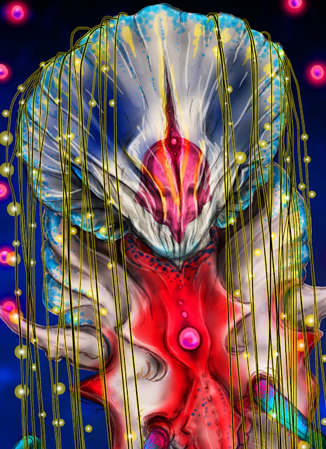
My concept: While I have to stand strong by my FXU prof, Stella, her and Jasmine had a tough time with that helmet jelly, so I wanted to take a stab at it. I love how it has that distinctive red organ shape inside of its translucent body, along with lots of bioluminescence. I also read that most of them swim upside down with their underside towards the surface, so I wanted to pull that into my design to create an interesting cowl and silhouette.


 Here is a more detailed view of the face design, which I wanted to hint at humanoid, but still keep very distant and alien.


Top Looks of the Week


Tyler and Emily's dragonfish alien and Logan and Adam's octopus alien. I thought the use of the green paint to bring in the sides of the model's figure on the dragonfish was a smart use of the green screen without overdoing it. I also liked the thinking behind the arms, but the shapes in the face and extensions create a really beautiful form. Nice job! And Logan and Adam created this sci-fi masterpiece with very traditional alien shapes done in a fresh way. I like the fusion of organic and mechanical material and I think the muscles in the neck sculpture are a nice hint at the anatomy underneath the suit. Great work guys!

Looking forward to the Angels and Demons!!
Cannot wait to see what you have in store this week! Be sure to tweet and comment on Instagram!


                                FACEBOOK          TWITTER          INSTAGRAM

Wednesday, April 13, 2016

Sinister Showdown, 10.13-14


FINALE HERE WE ARE!!!

This is so cool that we are able to share our concepts for the finale as the artists show their final looks for Season 10!

Again, THANK YOU: This season's artists have been some of the most welcoming and entertaining and we are so glad we have had the chance to share all of this with you. We hope you will continue to Tweet with us into the next season (excited to see some All-Stars come back again!)

The challenge: 

Create the characters from "Hell Hole" based on the descriptions in one of the director's script

Our concepts: I created my characters based on John Wynn's script. His description of the demon had more deep sea fish-like characteristics so I wanted to bring that to the jaw and facial structures, giving him a very anglerfish-like eye for seeing in the dark. My demon is  thin, scrawny, and humanoid, dripping and leaking oil form his body. My possessed character is transforming into the doll, with seams appearing all over his body and covering his eye.
Seth created his demon based on James McGuire's script, showing off a pale and crusty ancient demon. His possessed character is experiencing a loss of consciousness from his body and sores on his face and chest.


BEST OF LUCK TO ALL OF YOU!!
For the first time, I would be thrilled with any of the artists winning this season! Each of you has demonstrated immense talent, and I can't wait to see the great things you do beyond the show!
Please continue to stay in touch.


                                FACEBOOK          TWITTER          INSTAGRAM